Create a presentation for your organization on cancer
Introductions
Data visualizations can be used in many different ways. They paint a picture of data to make it easier to interpret and understand. They are important for decision-makers because it gives them the opportunity to see analytical results presented visually, find relevance among variables, and predict the future.
Instructions
Imagine that the director of your department has tasked you with creating a presentation for your organization that illustrates a health issue.
Go to the Library and research a health topic (obesity, diabetes, heart disease, cancer, etc.). Locate scholarly sources that represent the data in a visual way (infographics, charts, graphs, etc.). Data visualizations may come from the CDC, NIH, American Heart Association, American Diabetes Association, National Association of Mental Illness, American Cancer Society, etc. You must use highly credible sources.
Use the template provided in the Course Documents area to complete your Assignment.
Create a 10-12 slide PowerPoint presentation using visual representations of the data from highly credible sources. There should be detailed speakers notes for each slide. The presentation should be in the following format:
- Title slide
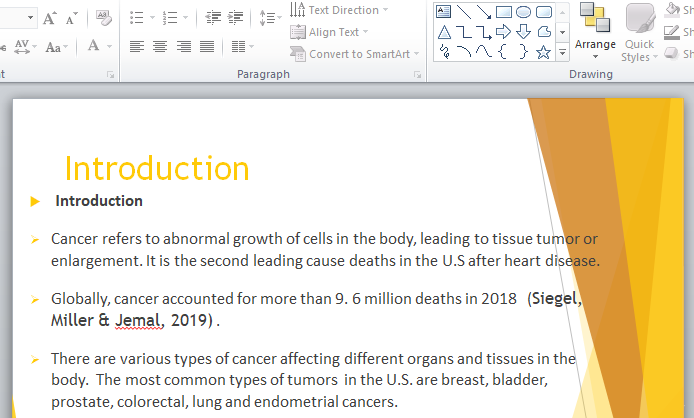
- Introduction slide
- Data visualization (3-4 visualizations, one on each slide). In the speaker notes area, provide a detailed description of that data in the visualizations.
- Analyze the data visualizations on the slides and within the speaker notes. (1-2 slides)
- Discuss how these visualizations can assist with organizational decision-making for program development. (1 slide)
- Recommend organizational action based on the combination of data from the visualizations. (1 slide)
- Conclusion slide
- Reference slide(s)

